
Choosing Colours That Work Together
Standing in front of a wall of yarn or floss with no idea which shades go together is a universal experience. A few simple principles will get you a long way — and none of them require a colour wheel on your phone.
Value matters more than colour
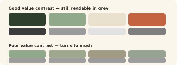
Value is how light or dark a colour is, regardless of its hue. It is the single most useful thing to understand, because a design with good contrast in value will read clearly even if the colours are unexpected, while a design where everything is the same value turns to mush from across the room.
The quick test: photograph your chosen colours together and view the photo in black and white. If they turn into an indistinguishable grey blur, you need more contrast. Your phone can do this in seconds and it's the trick professional designers use.
Three reliable schemes
- Monochrome — several shades of one colour, from pale to deep. Almost impossible to get wrong, and always looks considered.
- Analogous — colours that sit beside each other, like blue, teal and green. Harmonious and calm; the scheme most people find pleasing without knowing why.
- Complementary — opposites, like blue and orange or purple and yellow. High energy. Use one as the dominant and the other as an accent rather than fifty-fifty, which fights.
Planning a multicolour blanket?
Our blanket planner works out how many squares in each colour and how many balls of each you'll need, so you can buy the right amounts rather than three of one and none of another.
The 60-30-10 rule
Borrowed from interior design and it works beautifully for blankets and colourwork: 60% of a dominant colour, 30% of a secondary, 10% of an accent. Equal amounts of three colours look busy and undecided; this proportion looks deliberate.
Let a variegated yarn choose for you. Multi-coloured yarns are dyed by people whose job is colour. Pick one you love and choose your solids from the shades within it — an instant palette that's already been proven to work.
Neutrals do the heavy lifting
Cream, grey, oatmeal and charcoal give the eye somewhere to rest. A rainbow blanket separated by rounds of cream looks crisp and intentional; the same rainbow with no separation looks like a jumble. If a colour scheme feels chaotic, adding a neutral usually fixes it.
See it in daylight
Shop lighting and screen colours both lie. Take yarn or floss to a window before buying, and if you're ordering online, expect some variation and buy a single ball to check before committing to ten. Dye lots vary too — buy everything at once.
Questions we're often asked
How do I know if colours go together?
Photograph them together and view the picture in black and white. If they all turn to a similar grey, there isn't enough contrast in value and the design will look muddy however lovely the colours are individually.
How many colours should a blanket use?
Three to five is a comfortable range. Use one dominant colour, a secondary, and one or two accents, and consider a neutral between them to separate and calm the whole.
What is value in colour theory?
How light or dark a colour is, independent of its hue. Contrast in value is what makes a pattern readable from a distance, and it matters more than the specific colours chosen.